Best Gym Websites: Examples and Design Ideas That Win Members
Reviewed · By MGD Team
The best gym websites do one job well: they turn a visitor into a trial booking or a paying member. They open with a clear offer, keep the trial and WhatsApp buttons one tap away, show prices and the class timetable up front, and load fast on a phone.
Below are six gym website examples from MyGymDesk, the ten things the best gym websites have in common, and design ideas for gyms, CrossFit boxes and yoga and Pilates studios. Every example is a working website you can open and click through, and each one is customised to a gym's own brand, photos, plans and timetable when MyGymDesk builds it.
6 gym website examples from MyGymDesk
These are the six premium designs MyGymDesk builds gym and fitness studio websites from. Open a live demo on your phone to see how it feels to a new member.
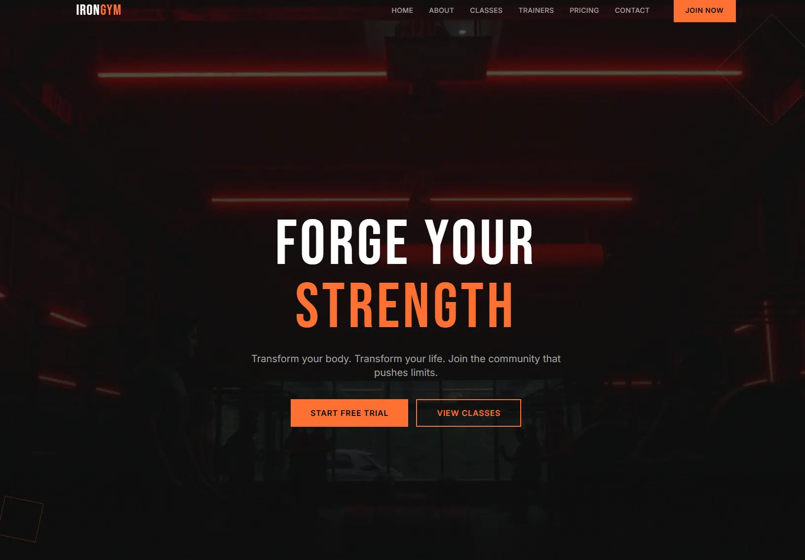
1. IRON: dark & bold
Best for: CrossFit, Strength Gyms, MMA
A full-screen dark hero with one bold promise, orange buttons and a Join Now button pinned to the menu. Start free trial and View classes sit right under the headline, so the two things a new visitor wants are one tap away.
Open the IRON demo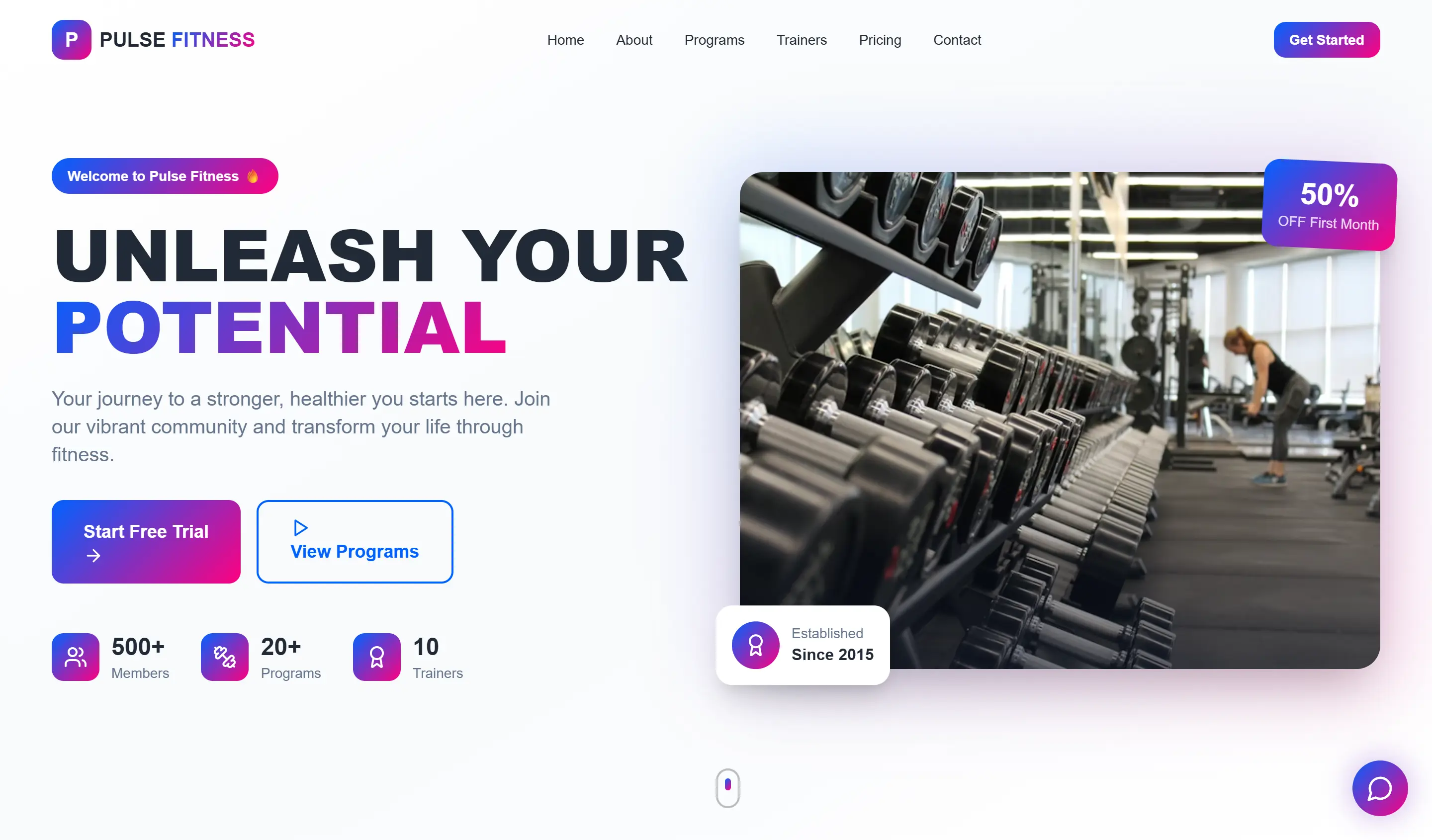
2. PULSE: vibrant & energetic
Best for: General Gym, Zumba, Dance
A bright, high-energy layout with an opening-offer badge on the hero photo, a Start free trial button and member, programme and trainer counts the gym fills in with its own numbers, plus a chat button in the corner.
Open the PULSE demo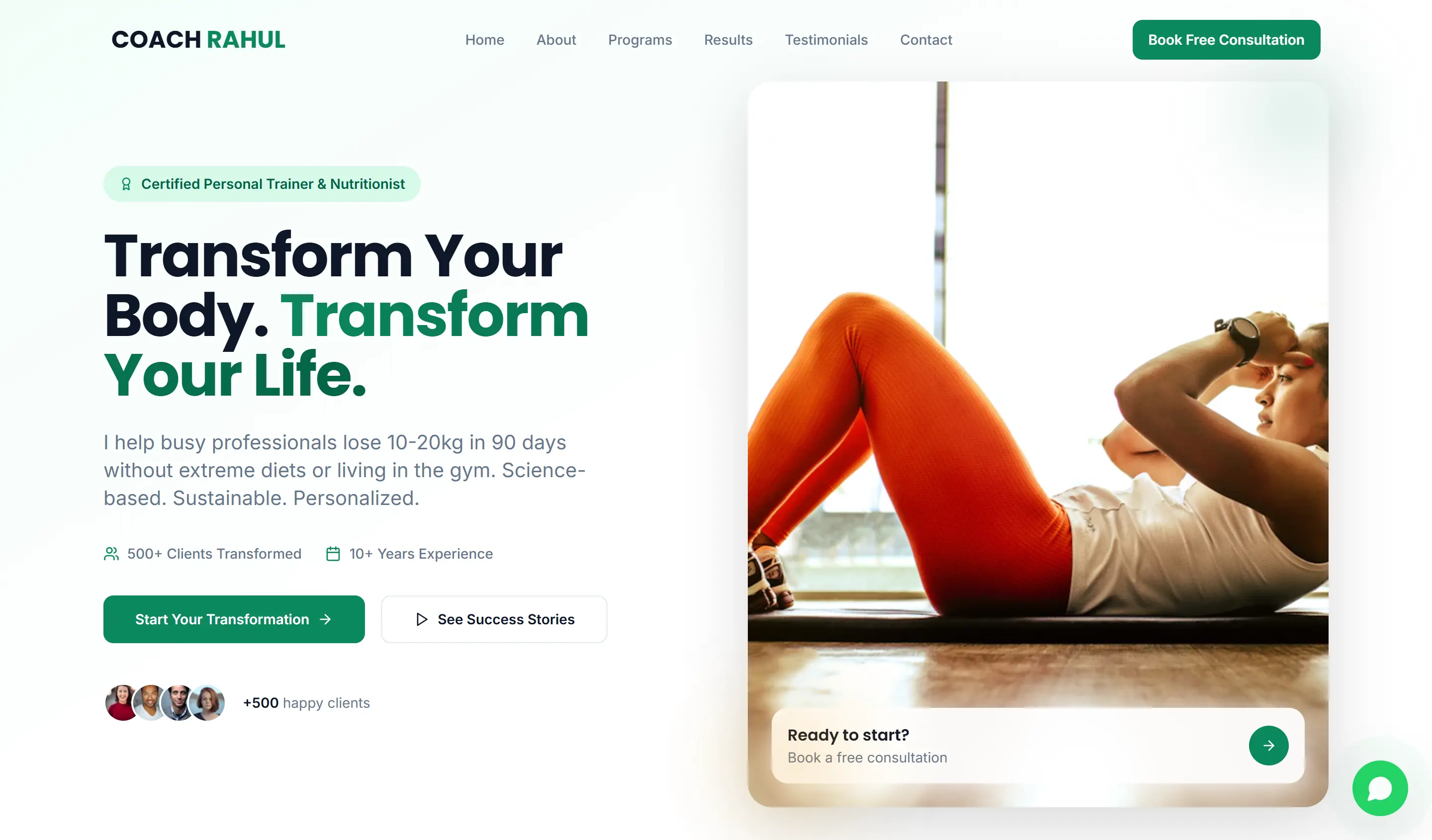
3. COACH: personal trainer
Best for: Personal Trainers, Coaches
Built around one person: a credentials badge, a results-led headline and a Book free consultation button in the menu, with a Ready to start? card on the hero photo. Programmes, results and testimonials each have a place in the menu.
Open the COACH demo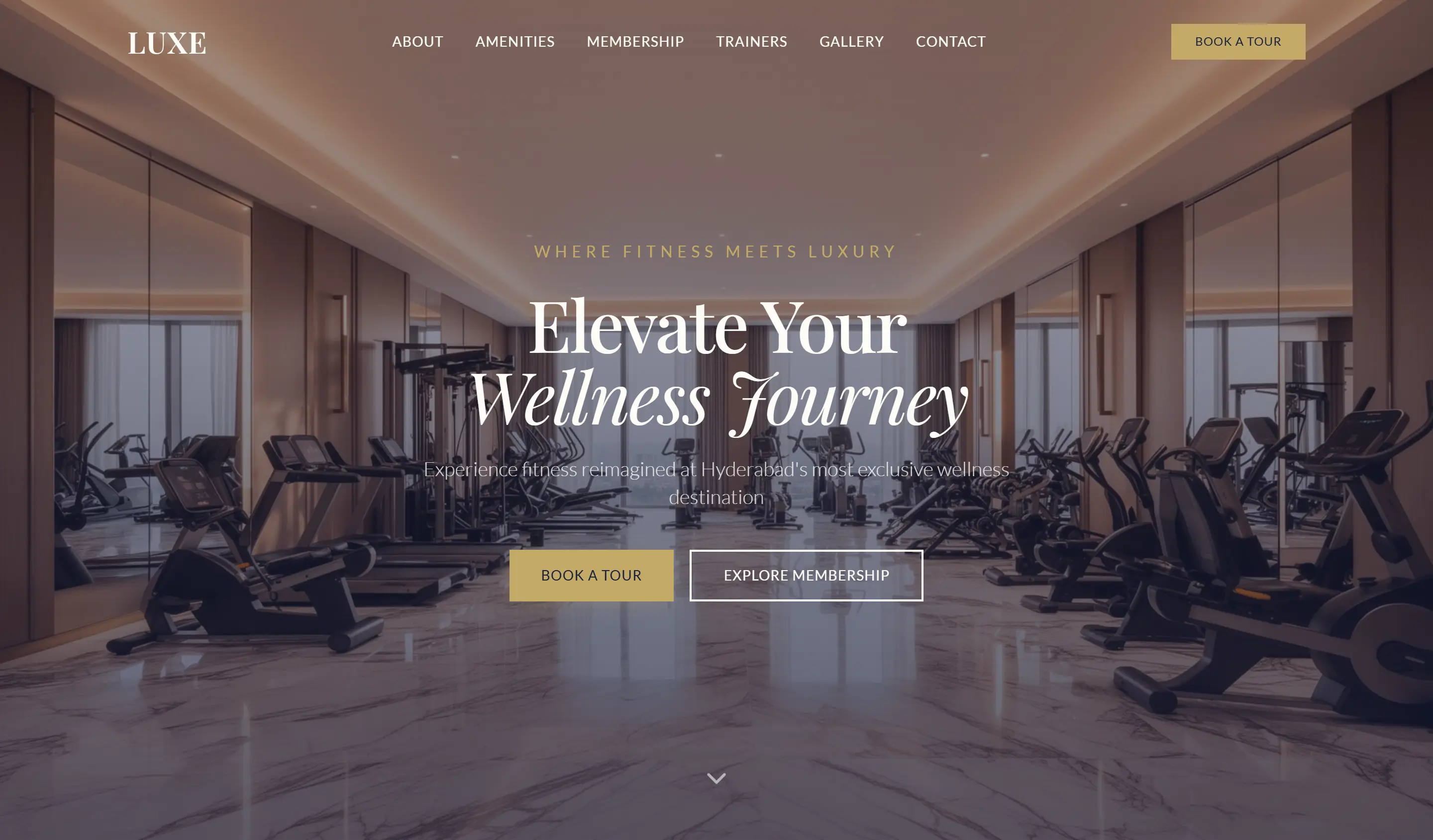
4. LUXE: luxury & premium
Best for: Boutique Studios, Premium Clubs
Serif type, gold accents and a full-width photo of the floor. Instead of a hard sell it asks visitors to Book a tour or Explore membership, the right ask for a premium club, with amenities, trainers and a gallery in the menu.
Open the LUXE demo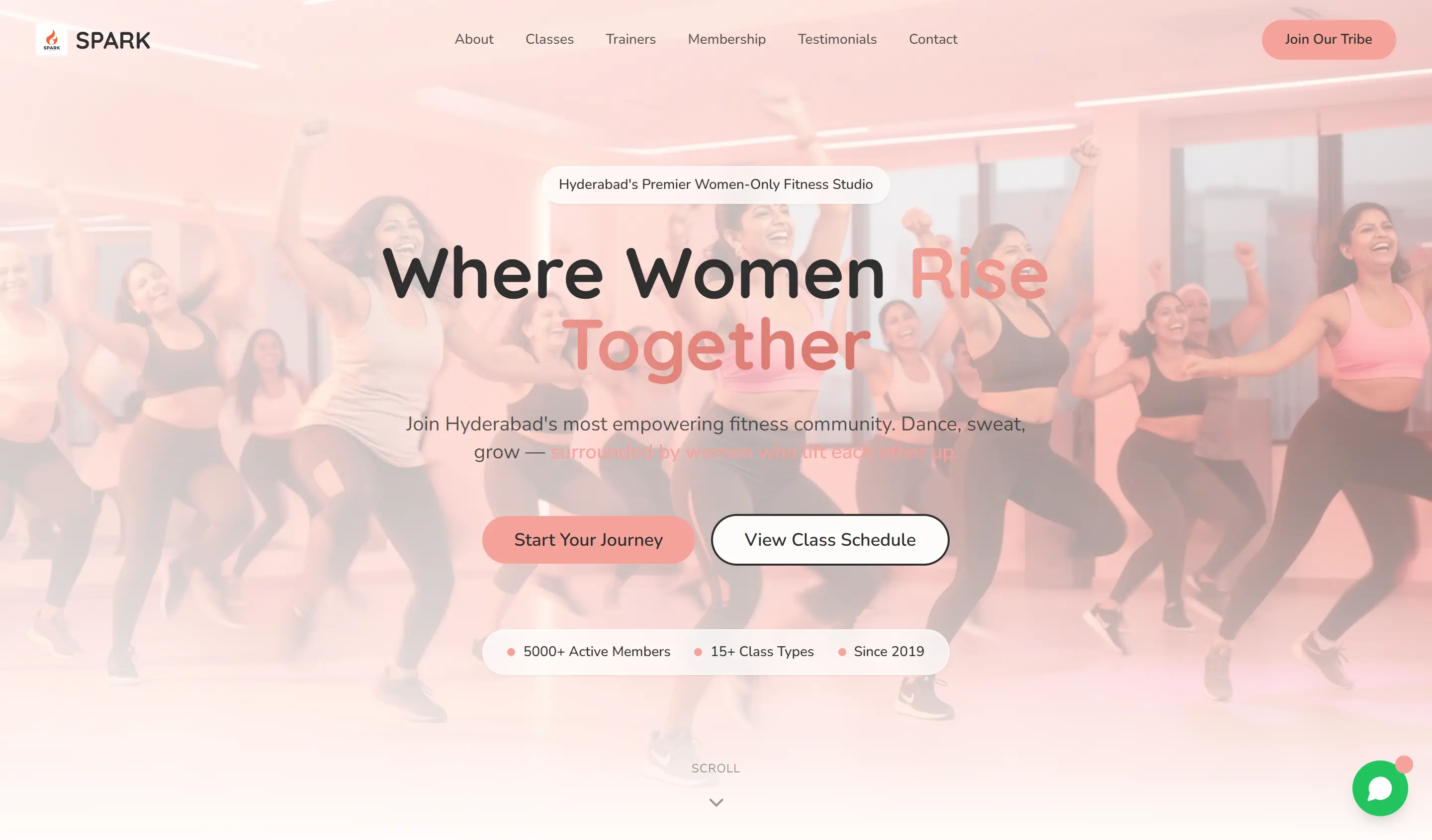
5. SPARK: bold & community
Best for: Women's Fitness, Barre, Dance
A warm, energetic hero built around community, with Start your journey and View class schedule buttons, a Join our tribe button in the menu and a chat button in the corner.
Open the SPARK demo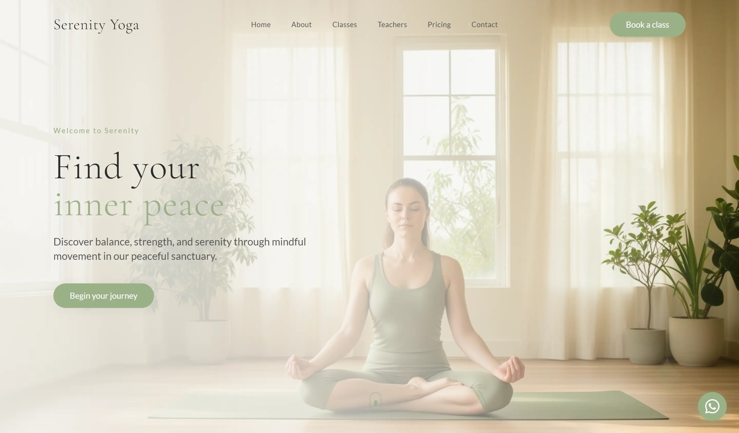
6. ZEN: calm & mindful
Best for: Yoga, Pilates, Wellness
Soft colours, an airy photo and quiet type that suit a yoga or Pilates studio. Book a class sits in the menu, classes, teachers and pricing are one tap away, and a WhatsApp button floats in the corner.
Open the ZEN demo
Compare them side by side, with colours and the gyms each one suits, on the gym website templates page.
What the best gym websites have in common
Look past the colours and fonts and the best gym websites share the same ten building blocks. Use them as a checklist for your own gym website design.
1. A hero offer visitors can act on
The first screen says who the gym is for and gives one reason to act now: a free trial, a first-month offer or a waived joining fee. The offer belongs above the fold, with its button, not three scrolls down.
2. A free trial button everywhere
The trial button sits in the menu, in the hero and at the end of every section, so it is always one tap away. Connected to MyGymDesk, a trial enquiry from your website lands in your MyGymDesk leads, ready for a follow-up call.
3. WhatsApp, one tap away
Plenty of people would rather send a message than fill in a form. A floating WhatsApp button on every page turns a question into a conversation, and every MyGymDesk gym website has one built in.
4. The class timetable, with booking
Class-led gyms and studios should show the week's timetable and let people book a spot. A MyGymDesk website can show your live class timetable from MyGymDesk and take class bookings with payment.
5. Prices on the page
Show membership prices, or at least a starting price, so visitors do not have to ask. Connected to MyGymDesk, your plan cards read your membership plans from MyGymDesk, so the website shows the plans you actually sell.
6. Online joining and payment
The best gym websites let a visitor become a member without a trip to the front desk. A MyGymDesk website can sell a membership online, and the new member is added to your gym in MyGymDesk with Member App access.
7. Trainer profiles
People join for the coaches as much as the equipment. Short profiles with a photo, specialities and certifications make your trainers a reason to choose you. Five of the six designs above have a trainers or teachers section in the menu.
8. Reviews and real photos
Member reviews, transformation stories and photos of your own floor build trust that a stock photo cannot. A MyGymDesk website can carry a testimonials carousel, a photo gallery with lightbox and your Instagram feed.
9. Google Maps and local SEO
Put the address, a Google Maps embed, opening hours and your phone number in the contact section, and keep them identical to your Google Business Profile. Every MyGymDesk gym website ships with Google Maps on the contact section and on-page SEO set up.
10. Speed on a phone
Many visitors arrive on a phone, often on mobile data, so the best gym websites load fast, with compressed images and no heavy plugins. MyGymDesk websites are built mobile-first on Next.js and deployed to Vercel's global edge network.
Gym website design ideas by type of gym
A strength gym and a yoga studio should not look alike. Start from the feeling your members get when they walk in, then let the website match it.
Gyms and fitness centers
Lead with the floor and the people: wide photos of your equipment, a clear membership offer and a timetable for group classes. Use one strong accent colour for every button so the trial and join actions stand out. Add a personal training section with trainer profiles and a Book a PT session button, and a page per branch if you run more than one location.
Designs to start from: PULSE (General Gym, Zumba, Dance) and IRON (CrossFit, Strength Gyms, MMA)
CrossFit boxes and strength gyms
Go dark and bold. Big type, high-contrast photos of real training and the class schedule high on the page set the tone. Make the first step obvious: a free intro class or a foundations course with its own booking button. Show your coaches' certifications and member results, and keep the drop-in rate easy to find for visitors in town for a week.
Designs to start from: IRON (CrossFit, Strength Gyms, MMA)
Yoga and Pilates studios
Calm beats loud. Light backgrounds, natural photos, generous white space and soft type match the experience in the room. The class timetable is the heart of the site, so put it one tap from the menu, with class levels and teacher names, and let people book a mat or reformer spot online. An intro class pack makes a good hero offer.
Designs to start from: ZEN (Yoga, Pilates, Wellness) and LUXE (Boutique Studios, Premium Clubs)
Personal trainers and boutique studios
A personal brand sells the person: one clear photo, credentials, a results-led headline and a Book a free consultation button. Boutique and women-only studios win on community: real member photos, a class schedule up front and a warm, welcoming tone.
Designs to start from: COACH (Personal Trainers, Coaches), SPARK (Women's Fitness, Barre, Dance) and LUXE (Boutique Studios, Premium Clubs)
Get a gym website like these
MyGymDesk designs and builds your gym website from one of these six designs, customised to your brand and live in 3–10 days, from $199. It is mobile-first and SEO-ready with WhatsApp built in, and it connects to MyGymDesk for online joining, payments and class booking.